Inner City Fire Protection Site & Identity
The first step was giving Inner City an in-print identity with a new logo design. A beautiful three-color logo was designed incorporating a very subtle red overlay over a soft blue and white under-layer. Important here was some indication of fire without having the logo overwhelmed with red.
With a print identity established, Inner City Fire Protection’s site was designed with a one-page WordPress™ template. The scrolling header provides an easily navigable interface with a filterable and paginated solution.
With an interactive scrolling and highlighted header menu the user interface is both simple and clean. The range of services Inner City offers, including system design, hood cleaning and 24/7 service capabilities are highlighted along with a customer profile area.
Inner City certainly could have chosen a more robust platform for its web presence. However under consultation with Elite Web Labs, the right product was aligned with Inner City’s business need. Mr. Williams now has an interactive one-page that is informative and can be easily and cost-effectively self managed for years to come.
Boston fire protection engineering company identity & website development.
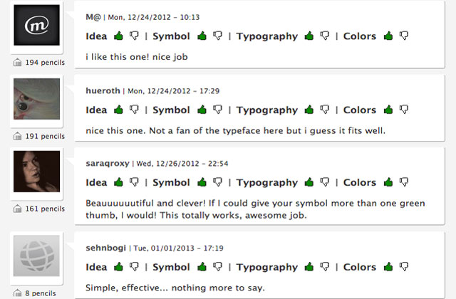
This project produced what I consider to be one of the best logos to ever be designed by Elite Web Labs. I was very excited to see that it received much acclaim on Brands of the World’s logo forum which is basically a collection of critics!